Summary:
- Fabbrica di San Pietro commissioned creative agency Studiogusto to transform authentic Renaissance manuscripts into a complete digital typeface called Michelangelus.
- The typeface draws directly from over 300 original letters preserved in the Casa Buonarroti museum and the Vatican Apostolic Archive.
- You get access to four font styles and over 500 glyphs at zero cost across Microsoft applications and print formats.
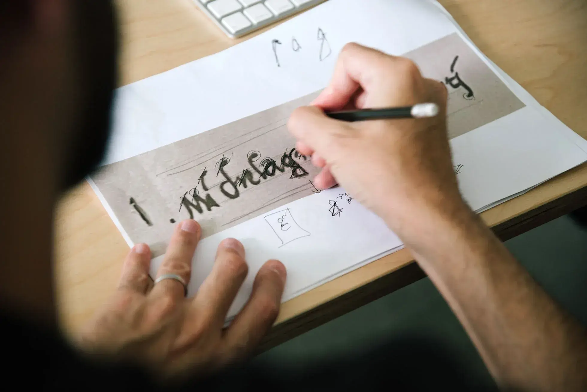
The institutional custodians of the Vatican have turned historic Renaissance script into a functional digital typeface. Commissioned by the Fabbrica di San Pietro, Italian design agency Studiogusto developed the Michelangelus font in direct cooperation with Microsoft. The project converts personal archival handwriting from Michelangelo Buonarroti into a standardized typographic family ready for contemporary screens and publication layouts.
Michelangelo left behind hundreds of handwritten sheets preserved across centuries of archival care. The primary documentation sits within the collection of the Casa Buonarroti museum in Florence, where curators maintain 342 autographed letters. Additional records come directly from the Vatican Apostolic Archive. Across these 300 historical manuscripts, researchers observe distinct shifts in the artist's graphic style over six decades of production.
During his formative training between 1496 and 1497, Michelangelo applied a rigid mercantesca script. This merchant gothic cursive dominated Florentine commercial counting houses, workshops, and trade guilds of the late fifteenth century. Young apprentices learned this dense, practical hand to maintain ledgers and log business transactions with speed. Following the turn of the century in 1500, Michelangelo changed his approach. His personal correspondence adopted the humanistic cursive favored across papal administrative offices, scholarly academies, and aristocratic chanceries. Surviving sketches, architectural contracts, and private letters reflect this intellectual transition toward Renaissance humanism, showing disciplined spacing, open letterforms, and fluid pen strokes.
The Fabbrica di San Pietro initiated the digital project to establish a modern identity for the basilica while honoring historical precedents. Agency founders Mimmo Berterame and Stefano Caliandro, who established Studiogusto in Perugia in 2004, led the development process. The agency previously designed digital communication platforms for the Vatican World Children's Day under Pope Francis, alongside branding assignments for international luxury clients. For the basilica initiative, the creative team pursued the objective to isolate “a visual logic, a system of proportions, rhythm and harmony measured by the eye of the artist, and translate them into a contemporary typographic system”.
To build the typographic architecture, digital type designers extracted precise geometric metrics from high-resolution archival scans. The team documented nib angles, uppercase constructions, terminal flourishes, negative space distribution, and the balance between rounded curves and acute intersections. Graphic specialists tracked the physical movement of the quill, studying how ink density changed across parchment fibers under varied hand pressure. Software engineers converted these calligraphic observations into clean vector drawings, resolving historical ink bleeds into sharp vector outlines while preserving the organic rhythm of the original script.
The resulting Michelangelus typeface delivers more than 500 individual glyphs across four distinct weights: Regular, Italic, Bold, and Bold Italic. The character inventory includes standard Latin alphabets, modern punctuation marks, historic ligatures, and sacred iconography such as Christian crosses and traditional Christograms. The balanced letterforms maintain legibility across dense editorial body text, large display headings, and responsive mobile interfaces.
You download the entire Michelangelus package at zero cost through the official project portal, with native integration prepared across Microsoft Office applications. The download package includes comprehensive historical annotations documenting each stage of development. The release comes paired with a specific digital license designed to protect typographic integrity and ensure authentic distribution across global networks. Whether you compose cultural essays, design print monographs, or format corporate reports, the font brings authentic sixteenth-century Renaissance structure directly into your modern digital workflow.
Andrea Darren
Born in Manchester, from a young age, she was passionate about art and design. She studied at the University of the Arts in London, where she developed her skills in these fields. Today, Andrea works as an editor for a renowned publishing house, combining her love for art and design with her editorial expertise.
Share this article


